Wednesday, January 25, 2012

Wax Paper Embossing Folder Resist

Here is a quick tutorial for the Wax Paper Embossing Folder Resist technique that my Stamp Club practiced last weekend. At each meeting, we make several projects, including a 6" x 6" page with technique directions and an example.


The sample above uses Melon Mambo and Pretty in Pink. I chose Concord Crush and Wisteria Wonder for the tutorial example.

1. Place a piece of wax paper inside your Embossing Folder. (For both my projects, I used the very popular Vintage Wallpaper folder.) Make the Big Shot sandwich (platform tab 1 + cutting plate + folder (with wax paper) + cutting plate), and run through the BS.

2. Place the wax paper between two pieces of Glossy White cs (glossy side facing the wax paper). Using plain paper to protect your iron, heat the cs and embossed wax paper. This will transfer wax in the pattern of the embossed design to the Glossy cs. (Experiment to find the right heat setting and time. Too little will not transfer the design; too much will transfer all of the wax.)


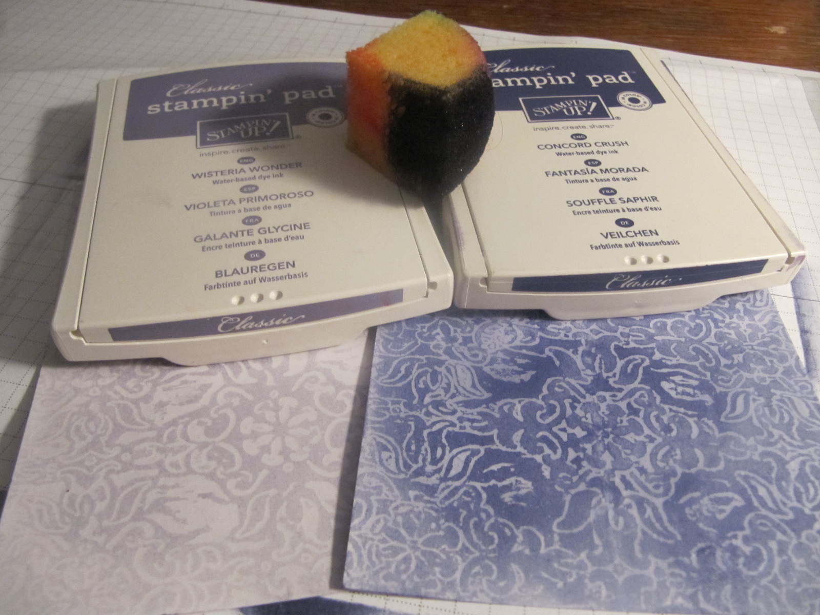
3. Use Stampin' Sponges to add Classic ink to the Glossy cs. If using more than one color, work from light to dark. (For the sample above, I used both light and dark inks on the lighter squares, and only the darker ink on the darker squares. In this example, I used either light or dark, but did not mix.)


4. Trim your Glossy cs to the size and shape you want and finish your project.


The images and sentiments on this card are from the Love & Sympathy stamp set.

I hope you'll give this technique a whirl. I love the way the colors pop out when I'm adding the ink to the embossed image. The effect is especially dramatic with deep, rich colors. Enjoy your stamping time!

Tuesday, January 24, 2012

Wax Paper Valentines

I'll post a tutorial soon of the Wax Paper Embossing Folder Resist technique that my Stamp Club learned last weekend. I can't think of a better use for your iron!

Here are two Valentines I made with some scraps that were left over. I designed the card with the Easel fold, which has a unique look but is really very straightforward (not much harder than a regular fold-in-half card, really).

For this first card, I used squares of the Glossy card stock that I had doctored up with the Vintage Wallpaper embossing folder, wax paper, ironing and sponging. I used two squares that are inked with Melon Mambo Classic Ink and two that have Pretty in Pink. The Full Heart Punch of Whisper White card stock with a sentiment from Grateful Greetings stamped in Melon Mambo ink completes the focal point and message. I added a little extra bling by dabbing the stamp with Champagne Mist Shimmer Paint before stamping.


Here's the card I made to take as my sample. Since I was concerned about running out of Glossy card stock, I used an odd-shaped piece and cut it into strips instead of squares. I like this look, too! I curled the edges with my Bone Folder, and secured the strips with Mini Glue Dots to make sure they weren't going anywhere. The heart on this card is punched from Shimmery White card stock, and the sentiment is pretty hard to see, because I stamped only with the Shimmer Paint. (It is better IRL.)


I hope you'll be inspired to make some of your own Valentines this year. If you see some products you like, please let me know, and I can help you order online or can place an order for you. Happy Stamping!

Saturday, January 21, 2012

Garden Trio

Stamp Club this afternoon was really fun! Thanks, Brenda, for your heated floors and the addictive "Peanut Butter Blast." Did you know that there are over 70 Chex Mix recipes?

We learned the wax paper emboss resist technique today, but I'll post that later.

Here is one of the cards we made. It features Stampin' Up!'s From the Garden designer series paper. I was feeling the blue-green color combination, so we highlighted Pacific Point and Wild Wasabi, with splashes of Daffodil Delight, Melon Mambo and Tangerine Tango.


(Not sure why my image is sideways...Sorry about that!)

I stole the layout for this card from the Idea Book & Catalog. Check out the sample for Sincere Salutations, and you'll be able to see that I simplified the design, and changed the colors and embellishments slightly.

The Wild Wasabi panel is textured with the Vintage Wallpaper embossing folder in the Big Shot. We also used the BS and Circles die to cut the large circles for the flower. We made "petals" by making small cuts all around the edge with the ever-faithful Paper Snips.

With all this texture and depth, I recommend using Sticky Strip, Mini Glue Dots and Stampin' Dimensionals to put this card together. The white card liner features a sentiment (from Sincere Salutations) stamped in Pacific Point as well as a trio of punched dsp squares. For an added touch, line your envelope with some dsp, too!

Don't forget that Sale-A-Bration starts on Tuesday (January 24-March 31, 2012). Now's your chance to earn FREE product with $50 purchase, or even more when you host a qualifying workshop. I have a few available dates, so contact me if you're interested in some free stuff!

Happy Stamping!

Sunday, January 8, 2012

Polynesian

When I delivered these cards today, Janet described the look as "Polynesian." I hadn't thought of that, but I do think it fits.


The color combination is form the Well Worn designer series paper from Stampin' Up!. I added More Mustard and So Saffron to the Not Quite Navy, Crumb Cake and Cajun Craze. I copied the layout from some cards I made a while back, but for this rendition I went a lot fancier, adding the punched, creased, sponged and glittered flowers in place of a flat image panel. Each flower center has a secret, too: a tiny dot of Crystal Effects.

All the stamps I used for these cards are from retired sets. The flower is from Polka Dot Punches (an old Sale-a-Bration set). The stamps in this set each coordinate with a punch (this is the 5-Petal Flower Punch). For the sentiment, I used two different stamps from All Year Cheer I. I love how big and bold these sentiments are.


Don't forget that Stampin' Up!'s biggest event of the year begins on January 24: Sale-A-Bration! There are free product offers and incentives if you are interested in signing up to be your very own SU! demo! I would love to have you as part of my "downline." Contact me if you have questions or if you think you might like to host a workshop during Sale-A-Bration. It is a great time to earn lots of fun freebies.

(P.S. In case you are wondering, the grey fluffy thing behind my cards is Spalding the cat. He's always mugging for the camera.)

Friday, January 6, 2012

Color Challenge

Not that I haven't been stamping, but I've had a hard time following through with photographing and posting my cards. Tonight I'm feeling creative and energetic, and managed to finish the job. Yea, me!

I found this color challenge (Island Indigo, Lucky Limeade, Basic Grey) at Splitcoaststampers. I wasn't too jazzed about it at first, but I really like how my cards turned out.


I used the rock-n-roll technique (inked with Lucky Limeade and then rolled in Island Indigo)for the flower image from Close as a Memory. The white mat is embossed with a Texturz plate and then sponged with both colors. I used the Color Spritzer Tool with my Pear Pizzazz marker to add a little dimension to the image panel.


On the inside, I stamped the curlicue image from Baroque Motifs in Lucky Limeade, and then added the Mother Teresa quote from Butterfly of Happiness.