Here's a card for Anna, who will be playing in several piano competitions this summer.
Card base is the delightful Wisteria Wonder (matching ruffled ribbon),and the Top Note die-cut is Concord Crush. The butterflies are die-cut with SU!'s Butterflies die, and I added Swiss Dots with a Texturz plate. I'm liking the Rhinestones, too! No stamping on the card front, but the inside has the "Plant your feet firmly and let your heart have wings" sentiment from the Hope Happens stamp set.
Showing posts with label Stampin' Up. Show all posts
Tuesday, May 22, 2012
Sunday, May 20, 2012
Three-Panel Layout
For this week's CAS challenge over at splitcoaststampers.com, I pulled out my old favorite, Best Blossoms. To lend a more manly look to this Thank You card, I used SU!'s Well Worn dsp.
The card base is River Rock, with a Not Quite Navy mat under the panel of the circle pattern from Well Worn. I stamped images from Best Blossoms in Soft Suede, So Saffron and Cajun Craze inks--all colors from the dsp scheme. Instead of cutting the larger image into three squared-off panels, I decided to use my 1 1/4" Circle Punch to mirror the pattern in the background. The edges of the NQN mat are distressed, and both the main panel and the image circles are popped up with Stampin' Dimensionals.
I went to town for the inside message panel, too. The Very Vanilla panel is embellished with more images from Best Blossoms, and it is mounted on another piece of dsp from Well Worn.
Every time I use this paper and these colors, I decide I love them all over again.
The card base is River Rock, with a Not Quite Navy mat under the panel of the circle pattern from Well Worn. I stamped images from Best Blossoms in Soft Suede, So Saffron and Cajun Craze inks--all colors from the dsp scheme. Instead of cutting the larger image into three squared-off panels, I decided to use my 1 1/4" Circle Punch to mirror the pattern in the background. The edges of the NQN mat are distressed, and both the main panel and the image circles are popped up with Stampin' Dimensionals.
I went to town for the inside message panel, too. The Very Vanilla panel is embellished with more images from Best Blossoms, and it is mounted on another piece of dsp from Well Worn.
Every time I use this paper and these colors, I decide I love them all over again.
Saturday, May 19, 2012
Baby Girl!
We're soooooo excited to be welcoming a baby girl into our extended family in a few months! My sisters in law are throwing a shower, so naturally I volunteered to make the invitations.
I kept this project simple with a postcard-style design. Invite information will be printed and taped to the back.
The front was simple, too. Can you believe that the dsp I used is really Christmas-themed? SU!'s Letters to Santa paper features Riding Hood Red, Old Olive, Marina Mist, Early Espresso, Blushing Bride and Whisper White. Great colors for a baby girl! I didn't have quite enough of any one pattern to make all the invites, so I switched up the colors slightly for a second variation. I like them both. For a bit of girly bling, there's just one Basic Rhinestone at the top.
The images are all from SU!'s Little Additions stamp set. I have the clear mount set, which was great for positioning the images together. Little Additions is a big set (21 images!), and I'm looking forward to finding lots more ways to use them all.
I kept this project simple with a postcard-style design. Invite information will be printed and taped to the back.
The front was simple, too. Can you believe that the dsp I used is really Christmas-themed? SU!'s Letters to Santa paper features Riding Hood Red, Old Olive, Marina Mist, Early Espresso, Blushing Bride and Whisper White. Great colors for a baby girl! I didn't have quite enough of any one pattern to make all the invites, so I switched up the colors slightly for a second variation. I like them both. For a bit of girly bling, there's just one Basic Rhinestone at the top.
The images are all from SU!'s Little Additions stamp set. I have the clear mount set, which was great for positioning the images together. Little Additions is a big set (21 images!), and I'm looking forward to finding lots more ways to use them all.
Wednesday, May 16, 2012
Mother's Day Happiness
Stamping while away from home can be daunting, but I've found that when I take the time to plan a project or two, I really enjoy the creativity and relaxation. Last week I was on the road for two nights, so I packed up two different projects to take along. Here's one. I'll post the other soon.
This card is really pretty simple, even though it has several elements and also features a variation on the Spotlight Technique. The card base is Soft Suede, with the image panel matted on Blushing Bride. I stamped the thyme image with Wild Wasabi, and then again with Chocolate Chip for the "spotlight." (Yes, I know spotlights are round, but by making it square, I saved myself from having to pack my round punch!) I figured the Scallop Edge Punch and Basic Pearls were just the ticket to feminize this design and layout for Mother's Day.
Of course, with a dark card base, I wanted to line my card with Very Vanilla. That gave me an opportunity to repeat the thyme image on the inside of the card, too. This time, I went for subtlety and stamped in pink. Even though I didn't use a specific Mother's Day sentiment, I think the message fits perfectly. I sent one to both my mom and my mother in law.
This stamp set, Herb Expressions, has four different herb images with coordinating sentiments. I love using it! If you like it, don't miss the boat--this is one of the many sets that SU! is retiring at the end of May! Check the website www.stampinup.com or contact me if you'd like to order.
Special thanks to my friends Erin and Peggy from work who stamped with me!
This card is really pretty simple, even though it has several elements and also features a variation on the Spotlight Technique. The card base is Soft Suede, with the image panel matted on Blushing Bride. I stamped the thyme image with Wild Wasabi, and then again with Chocolate Chip for the "spotlight." (Yes, I know spotlights are round, but by making it square, I saved myself from having to pack my round punch!) I figured the Scallop Edge Punch and Basic Pearls were just the ticket to feminize this design and layout for Mother's Day.
Of course, with a dark card base, I wanted to line my card with Very Vanilla. That gave me an opportunity to repeat the thyme image on the inside of the card, too. This time, I went for subtlety and stamped in pink. Even though I didn't use a specific Mother's Day sentiment, I think the message fits perfectly. I sent one to both my mom and my mother in law.
This stamp set, Herb Expressions, has four different herb images with coordinating sentiments. I love using it! If you like it, don't miss the boat--this is one of the many sets that SU! is retiring at the end of May! Check the website www.stampinup.com or contact me if you'd like to order.
Special thanks to my friends Erin and Peggy from work who stamped with me!
Wednesday, March 21, 2012
Happy for Butterflies, Happy for You
Here is my personal favorite card that I made for the recent Virtual Stamp Night (VSN) at splitcoaststampers.com.
This challenge was to use a spring element somewhere on the card; I used a coiled wire as the body of the large butterfly.
A lot of the cards I made for this VSN were much simpler than this, and in general I've gotten away from a lot of fancy layers in much of my card making. Sometimes it just feels good to really lay it on, though! This design has six layers (including the butterflies), dry embossing, lots of sponging and both the wire embellishment and some half-back pearls. Both the butterflies and the dry embossing are courtesy of Stampin' Up!'s fabulous Big Shot die cut machine. I (well, actually DD#2) cut Marina Mist card stock with the Butterflies die, and then I used the ever-popular Vintage Wallpaper embossing folder and sponging (Marina Mist ink) to add texture to both butterflies and mat.
The Always Artichoke swirl is from Baroque Motifs, and the sentiment ("I am glad there is you") is from a set of rub-ons that I've had for years. I really like the bright, crisp look of the rub-on on top of the Always Artichoke card stock.
I sent this card home with my sister at the end of her almost 6-week stay while Mom recovered from surgery. It is for her partner, who graciously made do on her own all that time. I am truly glad that there is her!
I liked this design so much that I reprised it in more Spring-like colors and with gold sponging as an Easter card. It also was a featured project at our March Stamp Club meeting.
This challenge was to use a spring element somewhere on the card; I used a coiled wire as the body of the large butterfly.
A lot of the cards I made for this VSN were much simpler than this, and in general I've gotten away from a lot of fancy layers in much of my card making. Sometimes it just feels good to really lay it on, though! This design has six layers (including the butterflies), dry embossing, lots of sponging and both the wire embellishment and some half-back pearls. Both the butterflies and the dry embossing are courtesy of Stampin' Up!'s fabulous Big Shot die cut machine. I (well, actually DD#2) cut Marina Mist card stock with the Butterflies die, and then I used the ever-popular Vintage Wallpaper embossing folder and sponging (Marina Mist ink) to add texture to both butterflies and mat.
The Always Artichoke swirl is from Baroque Motifs, and the sentiment ("I am glad there is you") is from a set of rub-ons that I've had for years. I really like the bright, crisp look of the rub-on on top of the Always Artichoke card stock.
I sent this card home with my sister at the end of her almost 6-week stay while Mom recovered from surgery. It is for her partner, who graciously made do on her own all that time. I am truly glad that there is her!
I liked this design so much that I reprised it in more Spring-like colors and with gold sponging as an Easter card. It also was a featured project at our March Stamp Club meeting.
Wednesday, January 25, 2012
Wax Paper Embossing Folder Resist
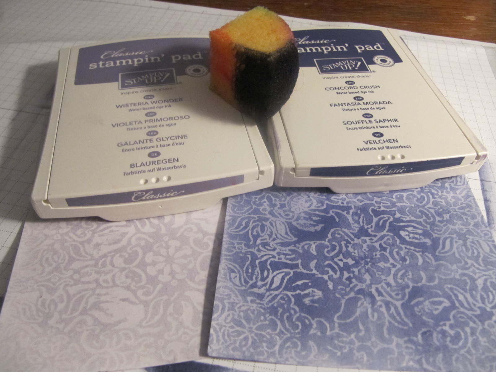
Here is a quick tutorial for the Wax Paper Embossing Folder Resist technique that my Stamp Club practiced last weekend. At each meeting, we make several projects, including a 6" x 6" page with technique directions and an example.
The sample above uses Melon Mambo and Pretty in Pink. I chose Concord Crush and Wisteria Wonder for the tutorial example.
1. Place a piece of wax paper inside your Embossing Folder. (For both my projects, I used the very popular Vintage Wallpaper folder.) Make the Big Shot sandwich (platform tab 1 + cutting plate + folder (with wax paper) + cutting plate), and run through the BS.
2. Place the wax paper between two pieces of Glossy White cs (glossy side facing the wax paper). Using plain paper to protect your iron, heat the cs and embossed wax paper. This will transfer wax in the pattern of the embossed design to the Glossy cs. (Experiment to find the right heat setting and time. Too little will not transfer the design; too much will transfer all of the wax.)
3. Use Stampin' Sponges to add Classic ink to the Glossy cs. If using more than one color, work from light to dark. (For the sample above, I used both light and dark inks on the lighter squares, and only the darker ink on the darker squares. In this example, I used either light or dark, but did not mix.)
4. Trim your Glossy cs to the size and shape you want and finish your project.
The images and sentiments on this card are from the Love & Sympathy stamp set.
I hope you'll give this technique a whirl. I love the way the colors pop out when I'm adding the ink to the embossed image. The effect is especially dramatic with deep, rich colors. Enjoy your stamping time!
The sample above uses Melon Mambo and Pretty in Pink. I chose Concord Crush and Wisteria Wonder for the tutorial example.
1. Place a piece of wax paper inside your Embossing Folder. (For both my projects, I used the very popular Vintage Wallpaper folder.) Make the Big Shot sandwich (platform tab 1 + cutting plate + folder (with wax paper) + cutting plate), and run through the BS.
2. Place the wax paper between two pieces of Glossy White cs (glossy side facing the wax paper). Using plain paper to protect your iron, heat the cs and embossed wax paper. This will transfer wax in the pattern of the embossed design to the Glossy cs. (Experiment to find the right heat setting and time. Too little will not transfer the design; too much will transfer all of the wax.)
3. Use Stampin' Sponges to add Classic ink to the Glossy cs. If using more than one color, work from light to dark. (For the sample above, I used both light and dark inks on the lighter squares, and only the darker ink on the darker squares. In this example, I used either light or dark, but did not mix.)
4. Trim your Glossy cs to the size and shape you want and finish your project.
The images and sentiments on this card are from the Love & Sympathy stamp set.
I hope you'll give this technique a whirl. I love the way the colors pop out when I'm adding the ink to the embossed image. The effect is especially dramatic with deep, rich colors. Enjoy your stamping time!
Labels:
embossing folder,
Love and Sympathy,
resist,
Stampin' Up,
sympathy,
tutorial,
wax paper
Tuesday, January 24, 2012
Wax Paper Valentines
I'll post a tutorial soon of the Wax Paper Embossing Folder Resist technique that my Stamp Club learned last weekend. I can't think of a better use for your iron!
Here are two Valentines I made with some scraps that were left over. I designed the card with the Easel fold, which has a unique look but is really very straightforward (not much harder than a regular fold-in-half card, really).
For this first card, I used squares of the Glossy card stock that I had doctored up with the Vintage Wallpaper embossing folder, wax paper, ironing and sponging. I used two squares that are inked with Melon Mambo Classic Ink and two that have Pretty in Pink. The Full Heart Punch of Whisper White card stock with a sentiment from Grateful Greetings stamped in Melon Mambo ink completes the focal point and message. I added a little extra bling by dabbing the stamp with Champagne Mist Shimmer Paint before stamping.
Here's the card I made to take as my sample. Since I was concerned about running out of Glossy card stock, I used an odd-shaped piece and cut it into strips instead of squares. I like this look, too! I curled the edges with my Bone Folder, and secured the strips with Mini Glue Dots to make sure they weren't going anywhere. The heart on this card is punched from Shimmery White card stock, and the sentiment is pretty hard to see, because I stamped only with the Shimmer Paint. (It is better IRL.)
I hope you'll be inspired to make some of your own Valentines this year. If you see some products you like, please let me know, and I can help you order online or can place an order for you. Happy Stamping!
Here are two Valentines I made with some scraps that were left over. I designed the card with the Easel fold, which has a unique look but is really very straightforward (not much harder than a regular fold-in-half card, really).
For this first card, I used squares of the Glossy card stock that I had doctored up with the Vintage Wallpaper embossing folder, wax paper, ironing and sponging. I used two squares that are inked with Melon Mambo Classic Ink and two that have Pretty in Pink. The Full Heart Punch of Whisper White card stock with a sentiment from Grateful Greetings stamped in Melon Mambo ink completes the focal point and message. I added a little extra bling by dabbing the stamp with Champagne Mist Shimmer Paint before stamping.
Here's the card I made to take as my sample. Since I was concerned about running out of Glossy card stock, I used an odd-shaped piece and cut it into strips instead of squares. I like this look, too! I curled the edges with my Bone Folder, and secured the strips with Mini Glue Dots to make sure they weren't going anywhere. The heart on this card is punched from Shimmery White card stock, and the sentiment is pretty hard to see, because I stamped only with the Shimmer Paint. (It is better IRL.)
I hope you'll be inspired to make some of your own Valentines this year. If you see some products you like, please let me know, and I can help you order online or can place an order for you. Happy Stamping!
Labels:
embossing folder,
resist,
Stampin' Up,
Valentine,
wax paper
Saturday, January 21, 2012
Garden Trio
Stamp Club this afternoon was really fun! Thanks, Brenda, for your heated floors and the addictive "Peanut Butter Blast." Did you know that there are over 70 Chex Mix recipes?
We learned the wax paper emboss resist technique today, but I'll post that later.
Here is one of the cards we made. It features Stampin' Up!'s From the Garden designer series paper. I was feeling the blue-green color combination, so we highlighted Pacific Point and Wild Wasabi, with splashes of Daffodil Delight, Melon Mambo and Tangerine Tango.
(Not sure why my image is sideways...Sorry about that!)
I stole the layout for this card from the Idea Book & Catalog. Check out the sample for Sincere Salutations, and you'll be able to see that I simplified the design, and changed the colors and embellishments slightly.
The Wild Wasabi panel is textured with the Vintage Wallpaper embossing folder in the Big Shot. We also used the BS and Circles die to cut the large circles for the flower. We made "petals" by making small cuts all around the edge with the ever-faithful Paper Snips.
With all this texture and depth, I recommend using Sticky Strip, Mini Glue Dots and Stampin' Dimensionals to put this card together. The white card liner features a sentiment (from Sincere Salutations) stamped in Pacific Point as well as a trio of punched dsp squares. For an added touch, line your envelope with some dsp, too!
Don't forget that Sale-A-Bration starts on Tuesday (January 24-March 31, 2012). Now's your chance to earn FREE product with $50 purchase, or even more when you host a qualifying workshop. I have a few available dates, so contact me if you're interested in some free stuff!
Happy Stamping!
We learned the wax paper emboss resist technique today, but I'll post that later.
Here is one of the cards we made. It features Stampin' Up!'s From the Garden designer series paper. I was feeling the blue-green color combination, so we highlighted Pacific Point and Wild Wasabi, with splashes of Daffodil Delight, Melon Mambo and Tangerine Tango.
(Not sure why my image is sideways...Sorry about that!)
I stole the layout for this card from the Idea Book & Catalog. Check out the sample for Sincere Salutations, and you'll be able to see that I simplified the design, and changed the colors and embellishments slightly.
The Wild Wasabi panel is textured with the Vintage Wallpaper embossing folder in the Big Shot. We also used the BS and Circles die to cut the large circles for the flower. We made "petals" by making small cuts all around the edge with the ever-faithful Paper Snips.
With all this texture and depth, I recommend using Sticky Strip, Mini Glue Dots and Stampin' Dimensionals to put this card together. The white card liner features a sentiment (from Sincere Salutations) stamped in Pacific Point as well as a trio of punched dsp squares. For an added touch, line your envelope with some dsp, too!
Don't forget that Sale-A-Bration starts on Tuesday (January 24-March 31, 2012). Now's your chance to earn FREE product with $50 purchase, or even more when you host a qualifying workshop. I have a few available dates, so contact me if you're interested in some free stuff!
Happy Stamping!
Sunday, January 8, 2012
Polynesian
When I delivered these cards today, Janet described the look as "Polynesian." I hadn't thought of that, but I do think it fits.
The color combination is form the Well Worn designer series paper from Stampin' Up!. I added More Mustard and So Saffron to the Not Quite Navy, Crumb Cake and Cajun Craze. I copied the layout from some cards I made a while back, but for this rendition I went a lot fancier, adding the punched, creased, sponged and glittered flowers in place of a flat image panel. Each flower center has a secret, too: a tiny dot of Crystal Effects.
All the stamps I used for these cards are from retired sets. The flower is from Polka Dot Punches (an old Sale-a-Bration set). The stamps in this set each coordinate with a punch (this is the 5-Petal Flower Punch). For the sentiment, I used two different stamps from All Year Cheer I. I love how big and bold these sentiments are.
Don't forget that Stampin' Up!'s biggest event of the year begins on January 24: Sale-A-Bration! There are free product offers and incentives if you are interested in signing up to be your very own SU! demo! I would love to have you as part of my "downline." Contact me if you have questions or if you think you might like to host a workshop during Sale-A-Bration. It is a great time to earn lots of fun freebies.
(P.S. In case you are wondering, the grey fluffy thing behind my cards is Spalding the cat. He's always mugging for the camera.)
The color combination is form the Well Worn designer series paper from Stampin' Up!. I added More Mustard and So Saffron to the Not Quite Navy, Crumb Cake and Cajun Craze. I copied the layout from some cards I made a while back, but for this rendition I went a lot fancier, adding the punched, creased, sponged and glittered flowers in place of a flat image panel. Each flower center has a secret, too: a tiny dot of Crystal Effects.
All the stamps I used for these cards are from retired sets. The flower is from Polka Dot Punches (an old Sale-a-Bration set). The stamps in this set each coordinate with a punch (this is the 5-Petal Flower Punch). For the sentiment, I used two different stamps from All Year Cheer I. I love how big and bold these sentiments are.
Don't forget that Stampin' Up!'s biggest event of the year begins on January 24: Sale-A-Bration! There are free product offers and incentives if you are interested in signing up to be your very own SU! demo! I would love to have you as part of my "downline." Contact me if you have questions or if you think you might like to host a workshop during Sale-A-Bration. It is a great time to earn lots of fun freebies.
(P.S. In case you are wondering, the grey fluffy thing behind my cards is Spalding the cat. He's always mugging for the camera.)
Friday, January 6, 2012
Color Challenge
Not that I haven't been stamping, but I've had a hard time following through with photographing and posting my cards. Tonight I'm feeling creative and energetic, and managed to finish the job. Yea, me!
I found this color challenge (Island Indigo, Lucky Limeade, Basic Grey) at Splitcoaststampers. I wasn't too jazzed about it at first, but I really like how my cards turned out.
I used the rock-n-roll technique (inked with Lucky Limeade and then rolled in Island Indigo)for the flower image from Close as a Memory. The white mat is embossed with a Texturz plate and then sponged with both colors. I used the Color Spritzer Tool with my Pear Pizzazz marker to add a little dimension to the image panel.
On the inside, I stamped the curlicue image from Baroque Motifs in Lucky Limeade, and then added the Mother Teresa quote from Butterfly of Happiness.
I found this color challenge (Island Indigo, Lucky Limeade, Basic Grey) at Splitcoaststampers. I wasn't too jazzed about it at first, but I really like how my cards turned out.
I used the rock-n-roll technique (inked with Lucky Limeade and then rolled in Island Indigo)for the flower image from Close as a Memory. The white mat is embossed with a Texturz plate and then sponged with both colors. I used the Color Spritzer Tool with my Pear Pizzazz marker to add a little dimension to the image panel.
On the inside, I stamped the curlicue image from Baroque Motifs in Lucky Limeade, and then added the Mother Teresa quote from Butterfly of Happiness.
Labels:
Close as a Memory,
color spritz,
flowers,
Rock-and-Roll,
scallop trim,
Stampin' Up,
sympathy
Saturday, November 12, 2011
Old and New
I still have quite a supply of "old" card stock hiding in my file drawer, and I draw on it when I make cards to donate. I needed to make a few small sets of cards quickly this weekend, so out came the retired colors!
Here I mixed old card stock (Creamy Caramel, Close to Cocoa, Mellow Moss and Cameo Coral) with current shapes and styles. I used Blender Pens to watercolor the (retired) Hostess Set image stamped with Basic Brown on a circle I die-cut with my Big Shot and the #2 Circles die. The Top Note die is a quick way to infuse a little interest in the mat, too.
I used another Top Note die-cut on the inside, and stamped it with the elegant sentiment from Wellness Wishes ("Praying for you during your illness"). The other stamps in that set are more light-hearted, including a feverish puppy and a Band-Aid with a sad face. It is nice to have a mix of styles in one set.
A second set of four cards used more retired colors paired with a current stamp set (Thanks for Caring). While the sentiments in this set are designed for use with sympathy cards, they work well for general "thinking of you" type cards as well.
On the inside of these cards I used the longer sentiment from the set, "May you find peace and comfort in this difficult time and know that you are loved." One hidden feature of this set is that it doesn't use "I" in the sentiments. I am often making cards to be sent from a group (our church), so all my "I" sentiments just don't quite fit. This set is right on the mark.
Here I mixed old card stock (Creamy Caramel, Close to Cocoa, Mellow Moss and Cameo Coral) with current shapes and styles. I used Blender Pens to watercolor the (retired) Hostess Set image stamped with Basic Brown on a circle I die-cut with my Big Shot and the #2 Circles die. The Top Note die is a quick way to infuse a little interest in the mat, too.
I used another Top Note die-cut on the inside, and stamped it with the elegant sentiment from Wellness Wishes ("Praying for you during your illness"). The other stamps in that set are more light-hearted, including a feverish puppy and a Band-Aid with a sad face. It is nice to have a mix of styles in one set.
A second set of four cards used more retired colors paired with a current stamp set (Thanks for Caring). While the sentiments in this set are designed for use with sympathy cards, they work well for general "thinking of you" type cards as well.
On the inside of these cards I used the longer sentiment from the set, "May you find peace and comfort in this difficult time and know that you are loved." One hidden feature of this set is that it doesn't use "I" in the sentiments. I am often making cards to be sent from a group (our church), so all my "I" sentiments just don't quite fit. This set is right on the mark.
Saturday, October 22, 2011
Faux Cloisonne Thanksgiving
Time to make some Thanksgiving cards! I pulled out an old stamp set (Tags & More) today, and paired it with current colors and designer papers.
Check out SU!'s Holiday Mini catalog--page 16--to see the inspiration for my layout. Following this design took me out of my comfort zone a bit. I wouldn't have used the Soft Suede panel on top of the same color base without a contrasting mat unless I had seen it done successfully, but I like it.
The main focus of my card is the gold-embossed leaves: I used the Faux Cloisonne technique. I stamped the leaf image onto a magazine page using VersaMark ink, and then embossed with gold ep. Cutting out the leaves was the most time-consuming part of making these cards, but my trusty Paper Snips was more than up to the task.
For the main panel, I layered a few strips and a 3 3/4" square of Well Worn paper on Soft Suede card stock, and popped that whole piece up with Stampin' Dimensionals. Mini Glue Dots were perfect for adhering the cut-out leaves, keeping them secure while allowing the edges to curl up slightly for dimension. I added a loop of 1/4" Basic Black grosgrain around the panel, too.
When I use dark card stock for my card base, I usually line the card with a light piece of card stock. For this set of cards, I cut pieces of Very Vanilla, stamped with leaves in both Cajun Craze and Soft Suede inks, and also added a Thanksgiving sentiment (from another retired set) in Cajun Craze.
One of my favorite ways to dress up a card is to add a liner to the envelope. I had just enough of the paper I used on the front of the cards to line all eight envelopes with the same pattern. Stamping one Cajun Craze leaf on the front of the envelopes was my final touch.
Thanksgiving is a perfect time to remember those in our lives for whom we are thankful. Why not make a few handmade cards to send off? Happy stamping!
Check out SU!'s Holiday Mini catalog--page 16--to see the inspiration for my layout. Following this design took me out of my comfort zone a bit. I wouldn't have used the Soft Suede panel on top of the same color base without a contrasting mat unless I had seen it done successfully, but I like it.
The main focus of my card is the gold-embossed leaves: I used the Faux Cloisonne technique. I stamped the leaf image onto a magazine page using VersaMark ink, and then embossed with gold ep. Cutting out the leaves was the most time-consuming part of making these cards, but my trusty Paper Snips was more than up to the task.
For the main panel, I layered a few strips and a 3 3/4" square of Well Worn paper on Soft Suede card stock, and popped that whole piece up with Stampin' Dimensionals. Mini Glue Dots were perfect for adhering the cut-out leaves, keeping them secure while allowing the edges to curl up slightly for dimension. I added a loop of 1/4" Basic Black grosgrain around the panel, too.
When I use dark card stock for my card base, I usually line the card with a light piece of card stock. For this set of cards, I cut pieces of Very Vanilla, stamped with leaves in both Cajun Craze and Soft Suede inks, and also added a Thanksgiving sentiment (from another retired set) in Cajun Craze.
One of my favorite ways to dress up a card is to add a liner to the envelope. I had just enough of the paper I used on the front of the cards to line all eight envelopes with the same pattern. Stamping one Cajun Craze leaf on the front of the envelopes was my final touch.
Thanksgiving is a perfect time to remember those in our lives for whom we are thankful. Why not make a few handmade cards to send off? Happy stamping!
Labels:
Faux Cloisonne',
Stampin' Up,
Tags and More,
Thanksgiving
Friday, October 21, 2011
A Silhouette Trio
Part Two of my six-card set was this group of cards made using the Plaid Silhouette technique.
Similar in versatility to the Rock and Roll technique I posted last week, Plaid Silhouette extends the range of your bold-image stamps. I love the combination of this technique with the elephant stamp from Animal Stories.
Here is a close-up of the card with a Rose Red base.
Again, I kept both the layout and stamping simple.
The Plaid Silhouette technique uses three ink colors. Here I selected So Saffron (light) and Rose Red and Old Olive (darker). After inking the stamp with the light ink, turn the stamp over and press the edge of one of the darker ink pads on the stamp to make a series of lines. Turn the stamp 90 degrees to make crossing lines. Repeat with another dark ink pad.
If you haven't tried this one, you should. You'll love the look you get.
Similar in versatility to the Rock and Roll technique I posted last week, Plaid Silhouette extends the range of your bold-image stamps. I love the combination of this technique with the elephant stamp from Animal Stories.
Here is a close-up of the card with a Rose Red base.
Again, I kept both the layout and stamping simple.
The Plaid Silhouette technique uses three ink colors. Here I selected So Saffron (light) and Rose Red and Old Olive (darker). After inking the stamp with the light ink, turn the stamp over and press the edge of one of the darker ink pads on the stamp to make a series of lines. Turn the stamp 90 degrees to make crossing lines. Repeat with another dark ink pad.
If you haven't tried this one, you should. You'll love the look you get.
Labels:
Animal Stories,
bold,
dsp,
elephant,
Plaid Silhouette,
Stampin' Up,
tutorial
Tuesday, October 18, 2011
An Old Favorite: Rock and Roll
I made a quick set of six cards last weekend. To save time and also make good use of some of my plentiful designer papers, I limited my stamping to one image. The rest of the detail of the card design is built right into this nifty (retired) patterned paper from Stampin' Up!.
I picked three of the colors from this paper to carry through in the cards: Old Olive, So Saffron and Rose Red. Each color served as one card base, and then I used two of the colors in the stamped owl images on each card.
Here is a close-up of the card with the Old Olive base.
After choosing the part of the design I wanted for the scenery/background, I stamped three owl images from Animal Stories. I used the Rock and Roll technique to add both Old Olive and So Saffron ink to the stamped image. It's simple. Ink the stamp with So Saffron ink. Roll the stamp on the Old Olive pad, so that the edges pick up the darker ink, but the center retains the lighter ink color. You can see that I used progressively more of the darker ink with each image I stamped.
Try this technique with some of your bold-image stamps for a fun new look!
I picked three of the colors from this paper to carry through in the cards: Old Olive, So Saffron and Rose Red. Each color served as one card base, and then I used two of the colors in the stamped owl images on each card.
Here is a close-up of the card with the Old Olive base.
After choosing the part of the design I wanted for the scenery/background, I stamped three owl images from Animal Stories. I used the Rock and Roll technique to add both Old Olive and So Saffron ink to the stamped image. It's simple. Ink the stamp with So Saffron ink. Roll the stamp on the Old Olive pad, so that the edges pick up the darker ink, but the center retains the lighter ink color. You can see that I used progressively more of the darker ink with each image I stamped.
Try this technique with some of your bold-image stamps for a fun new look!
Labels:
Animal Stories,
dsp,
owl,
Rock-and-Roll,
Stampin' Up
Saturday, September 24, 2011
You're on my mind
I stumbled across this color combination several months ago: Night of Navy and Cajun Craze. The mellow tones hit me just right.
There are a few people whom I've been thinking about lately, and I hope this simple card will brighten a day this week. The design is really straight forward: just a small rectangular image panel (actual dimensions don't matter too much), with the sentiment stamped directly onto the dark (Night of Navy) card base.
Using the Whisper White craft ink for to stamp "you're on my mind" cleans up the design by eliminating the need to add another panel and mat. The stamp set is the retired Delight in Life. These gentle flower images are some of my favorites. I stamped off the main image many times, and added a lot of sponging for softness.
If you like this card, consider putting on your crafting hat and relaxing with a little stamping this weekend! Thanks for looking.
There are a few people whom I've been thinking about lately, and I hope this simple card will brighten a day this week. The design is really straight forward: just a small rectangular image panel (actual dimensions don't matter too much), with the sentiment stamped directly onto the dark (Night of Navy) card base.
Using the Whisper White craft ink for to stamp "you're on my mind" cleans up the design by eliminating the need to add another panel and mat. The stamp set is the retired Delight in Life. These gentle flower images are some of my favorites. I stamped off the main image many times, and added a lot of sponging for softness.
If you like this card, consider putting on your crafting hat and relaxing with a little stamping this weekend! Thanks for looking.
Monday, August 29, 2011
Faux Leather (Masking Tape) Technique
I was inspired by the video tutorial on Splitcoaststampers.com by Beate Johns for the Faux Leather technique using masking tape. This past weekend was another SCS Virtual Stamp Night (VSN) set of challenges. The theme was Rodeo.
I didn't think I would get a chance to play at all, since I had to work on Saturday at the Great Minnesota Get Together. This afternoon, though, I pulled out some of my toys and managed to complete 5 of the challenges! It helps that there is a 45 minute time limit, but I was way under that for almost all of my cards. I think I used the full 45 minutes for this Dragon Skin card, though.
I used my newest stamp set, Dinoroar, which I got for my youngest. I think it is pretty cute! (Even if this image is of a flying reptile, not technically a dinosaur.)
I also took advantage of the current (until Wednesday 8/31) offer from SU! of buy 3, get 1 free on Designer Series Paper. I used the Well Worn dsp on this card and also on several others I made today.
Here's a quick tutorial for this method of Faux Leather.
1) Cover a piece of card stock (doesn't matter what color) with small pieces of masking tape. Try to cover any straight edges with a ripped piece.
2) Add a dark brown (here Early Espresso) ink to the torn edges of tape by rubbing a sponge across the surface.
3) Sponge a lighter shade (here Soft Suede) over the top (don't rub) to add color to the centers of the tape pieces.
4) Cover the sheet with clear embossing powder and heat set. (I noticed that some of my tape pieces curled up during the heating process, but I could easily push them back down when the piece had cooled.)
5) Finish the project! I ran my faux leather piece throught the Big Shot with the Top Note die to make the background for the pteranodon. He's stamped with Cajun Craze ink on Very Vanilla card stock. I used my Paper Snips to cut him out, and sponged the edge with Soft Suede ink.
There is more sponging around the edge of the dsp background (from Well Worn), and the card base is Cajun Craze. On the inside, I stamped the T. rex and a bit of the grass.
I'm planning on featuring this technique at the September meeting of my Techniques Club. Contact me if you are interested in joining. We have room for you!
I didn't think I would get a chance to play at all, since I had to work on Saturday at the Great Minnesota Get Together. This afternoon, though, I pulled out some of my toys and managed to complete 5 of the challenges! It helps that there is a 45 minute time limit, but I was way under that for almost all of my cards. I think I used the full 45 minutes for this Dragon Skin card, though.
I used my newest stamp set, Dinoroar, which I got for my youngest. I think it is pretty cute! (Even if this image is of a flying reptile, not technically a dinosaur.)
I also took advantage of the current (until Wednesday 8/31) offer from SU! of buy 3, get 1 free on Designer Series Paper. I used the Well Worn dsp on this card and also on several others I made today.
Here's a quick tutorial for this method of Faux Leather.
1) Cover a piece of card stock (doesn't matter what color) with small pieces of masking tape. Try to cover any straight edges with a ripped piece.
2) Add a dark brown (here Early Espresso) ink to the torn edges of tape by rubbing a sponge across the surface.
3) Sponge a lighter shade (here Soft Suede) over the top (don't rub) to add color to the centers of the tape pieces.
4) Cover the sheet with clear embossing powder and heat set. (I noticed that some of my tape pieces curled up during the heating process, but I could easily push them back down when the piece had cooled.)
5) Finish the project! I ran my faux leather piece throught the Big Shot with the Top Note die to make the background for the pteranodon. He's stamped with Cajun Craze ink on Very Vanilla card stock. I used my Paper Snips to cut him out, and sponged the edge with Soft Suede ink.
There is more sponging around the edge of the dsp background (from Well Worn), and the card base is Cajun Craze. On the inside, I stamped the T. rex and a bit of the grass.
I'm planning on featuring this technique at the September meeting of my Techniques Club. Contact me if you are interested in joining. We have room for you!
Labels:
birthday,
Dinoroar,
Faux Leather,
Masking tape,
Stampin' Up,
tutorial
Subscribe to:
Posts (Atom)